The Power of Color: How Color Psychology Influences Your Space
The Power of Color: How Color Psychology Influences Your Space
Introduction
When it comes to painting your home or business, the colors you choose are more than just a matter of preference—they can significantly impact the mood, energy, and overall feel of a space. This is the essence of color psychology, a fascinating field that explores how different hues affect human emotions and behaviors. In this post, we’ll explore how color psychology can help you make informed decisions when selecting colors for your space.
The Power of Color
LATEST EVENT
The Science Behind Color Psychology
Color psychology is based on the idea that colors can evoke specific emotional responses. For example, certain colors can make you feel calm and relaxed, while others can energize and stimulate your senses. Understanding these effects can help you choose colors that align with the atmosphere you want to create.
Warm Colors: Energize and Invigorate
Warm colors like red, orange, and yellow are known for their ability to energize and uplift. Red, for example, is often associated with passion, excitement, and energy. It's a great choice for spaces where you want to encourage activity and engagement, such as kitchens or dining rooms. However, because it’s a strong color, it’s best used as an accent rather than a dominant shade.
Orange brings a sense of warmth and enthusiasm, making it ideal for social spaces like living rooms or communal areas in businesses. Yellow, the color of sunshine, is associated with happiness and optimism. It’s perfect for areas where you want to create a cheerful, welcoming environment.
Cool Colors: Calm and Soothe
Cool colors like blue, green, and purple are often associated with calmness and tranquility. Blue, in particular, is known for its calming effects and is often used in bedrooms and bathrooms to create a serene atmosphere. It’s also a popular choice for offices as it can help increase productivity and focus.
Green, the color of nature, symbolizes balance and renewal. It’s an excellent choice for spaces where you want to promote relaxation and comfort, such as bedrooms, living rooms, or wellness centers. Purple, associated with luxury and creativity, can add a touch of elegance and sophistication to any room.
Neutral Colors: Versatile and Timeless
Neutral colors like white, gray, and beige are incredibly versatile and can be used in almost any setting. These colors provide a blank canvas that allows other elements of the room, such as furniture and decor, to stand out. White is associated with cleanliness and simplicity, making it a popular choice for modern and minimalist designs.
Gray offers a sophisticated and balanced look, ideal for spaces where you want to convey professionalism and calmness. Beige, a warm neutral, provides a cozy and inviting feel, perfect for creating a comfortable atmosphere in living spaces.
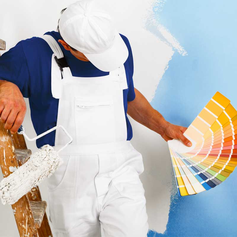
Using Color Psychology in Your Space
When choosing colors for your home or business, consider the mood and atmosphere you want to create. Do you want a space that energizes and invigorates, or one that calms and soothes? The right colors can make all the difference in achieving your desired effect.
Conclusion
Color psychology is a powerful tool that can transform any space. Whether you’re looking to create a lively, vibrant environment or a peaceful, relaxing retreat, understanding the psychological effects of colors can help you make the best choices for your painting project. If you’re ready to refresh your space with the perfect colors, our team at [Your Company Name] is here to help. Contact us today to get started!